Project Goals
Design a retail signage and packaging system that increases brand visibility, improves product navigation, and creates a clear, scalable structure for the brand within a competitive in-store environment.
Design Decisions
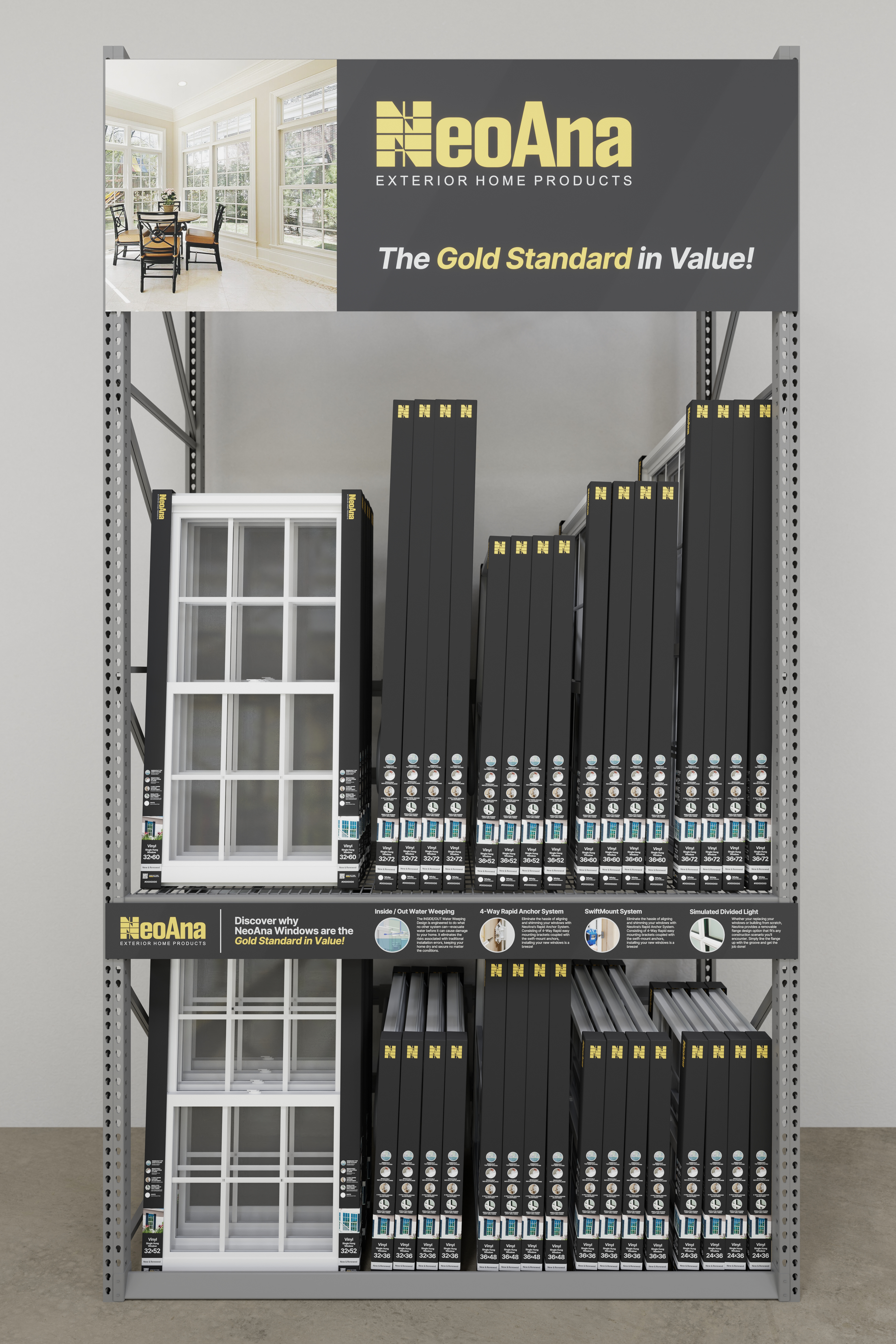
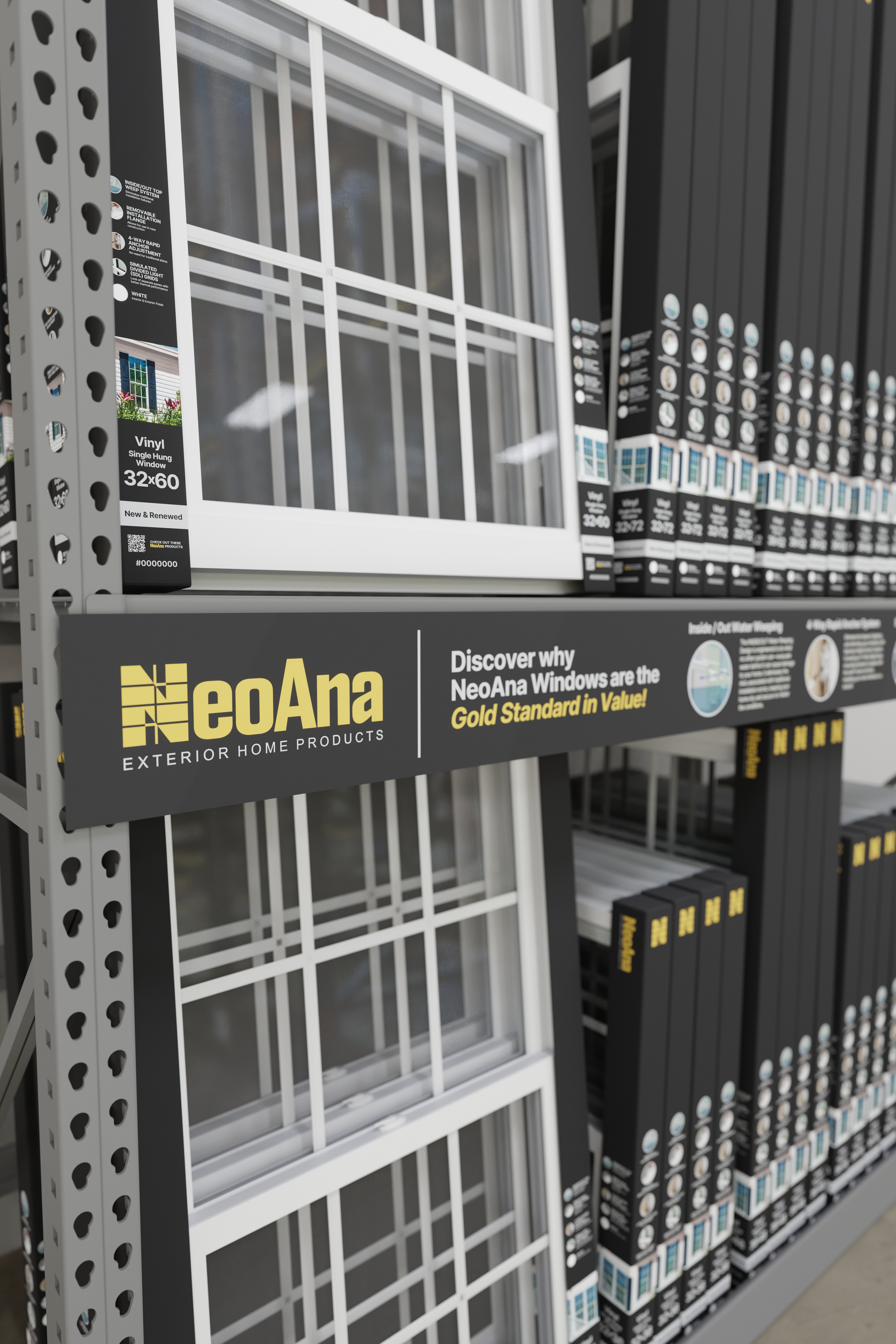
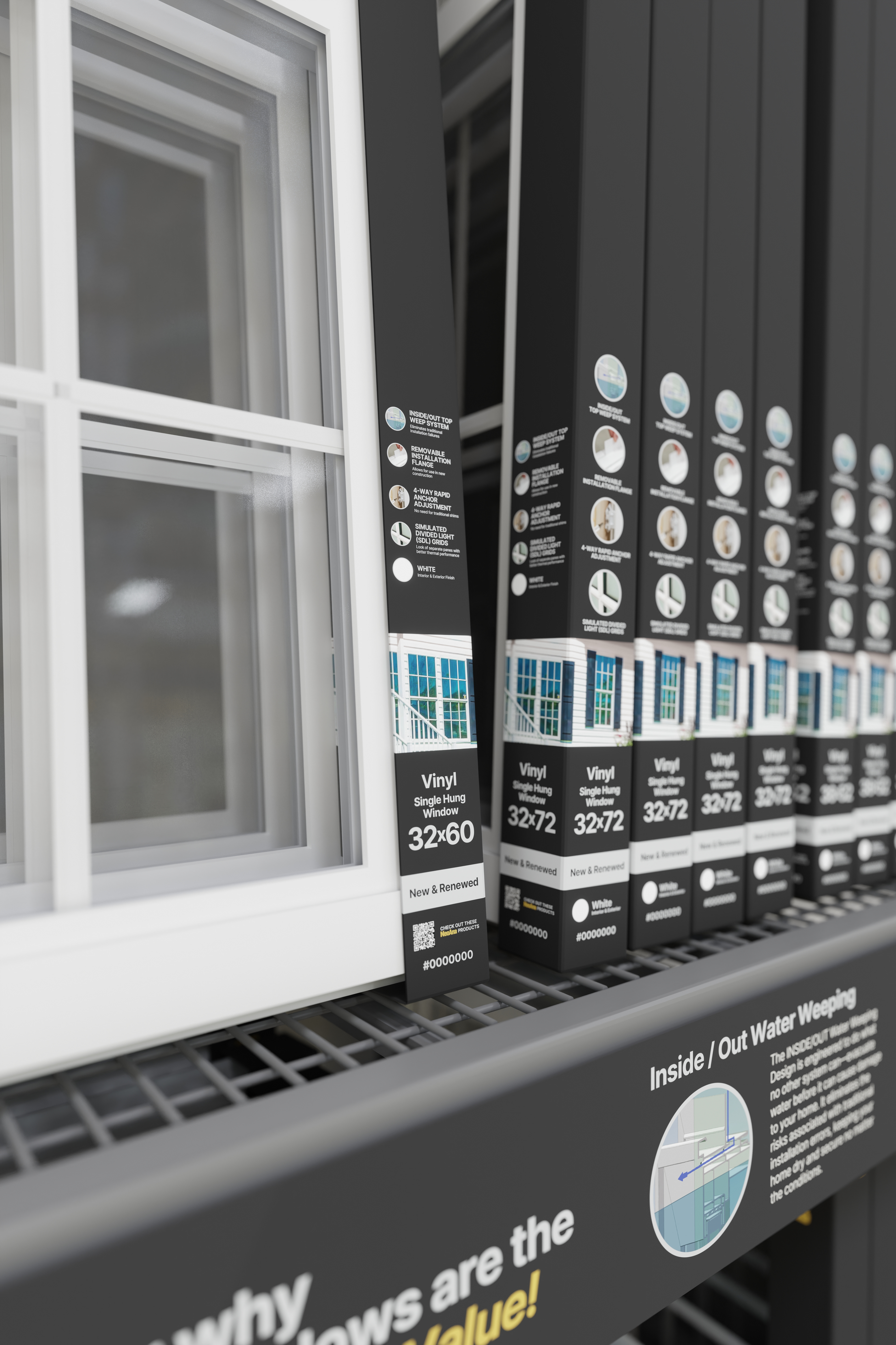
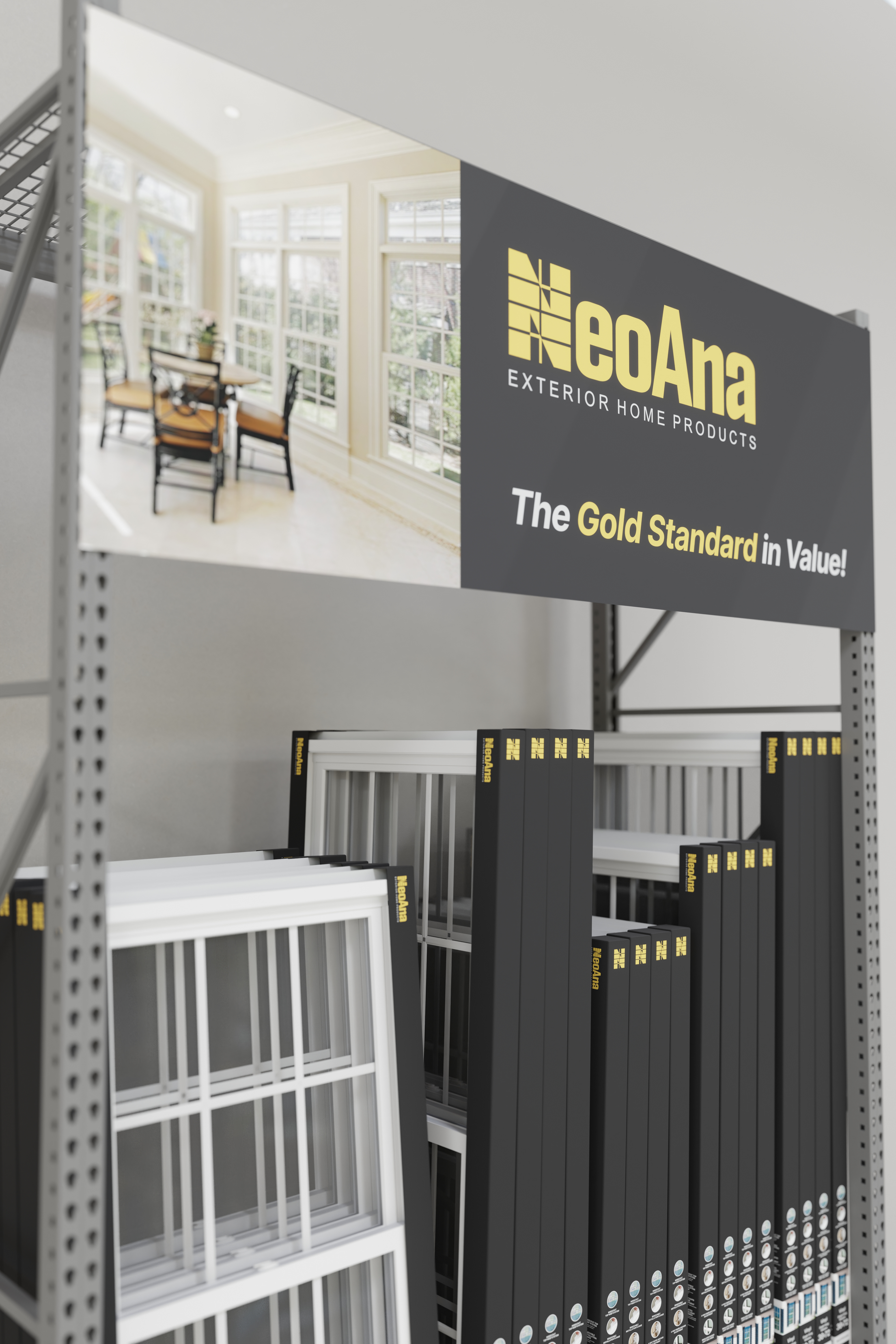
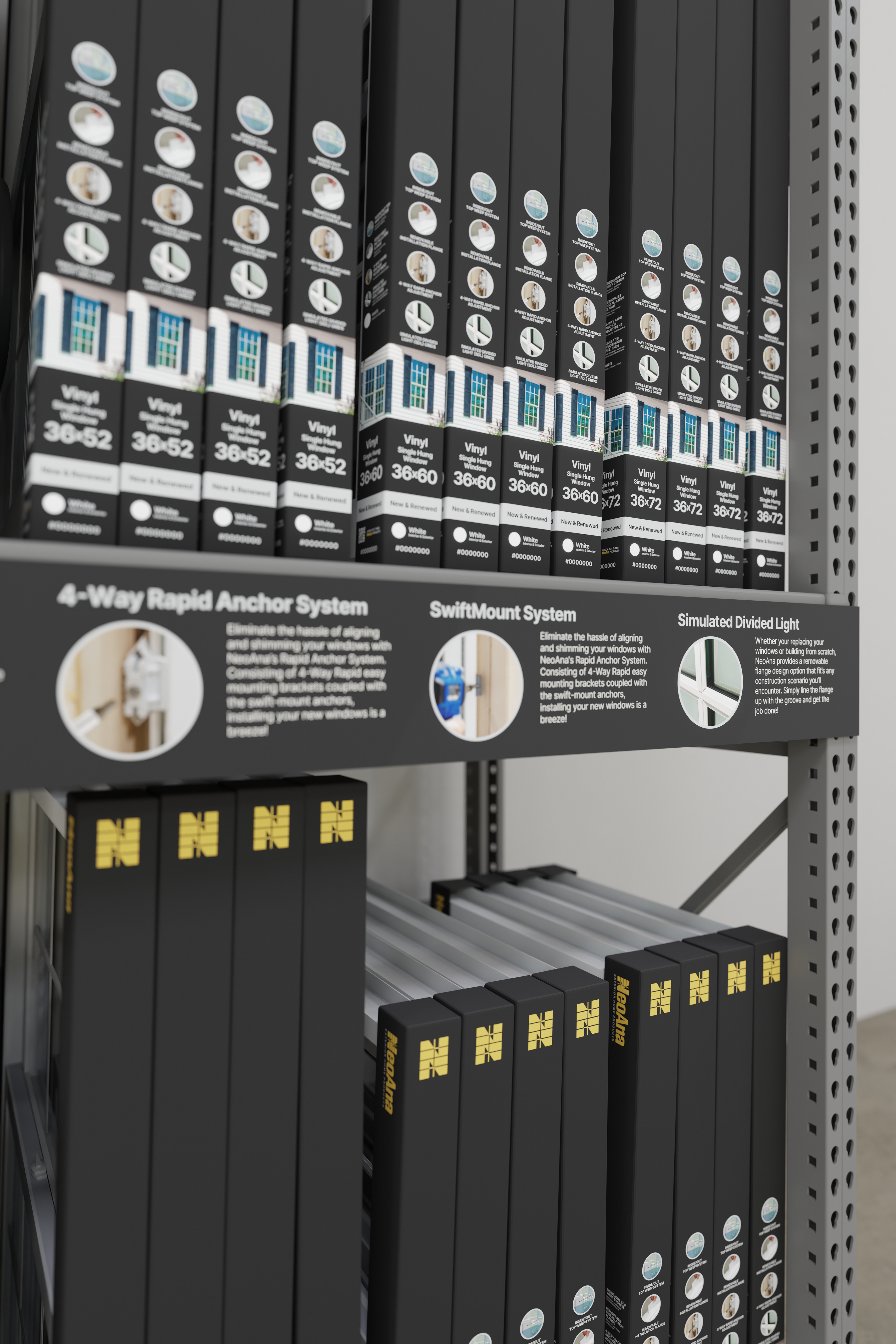
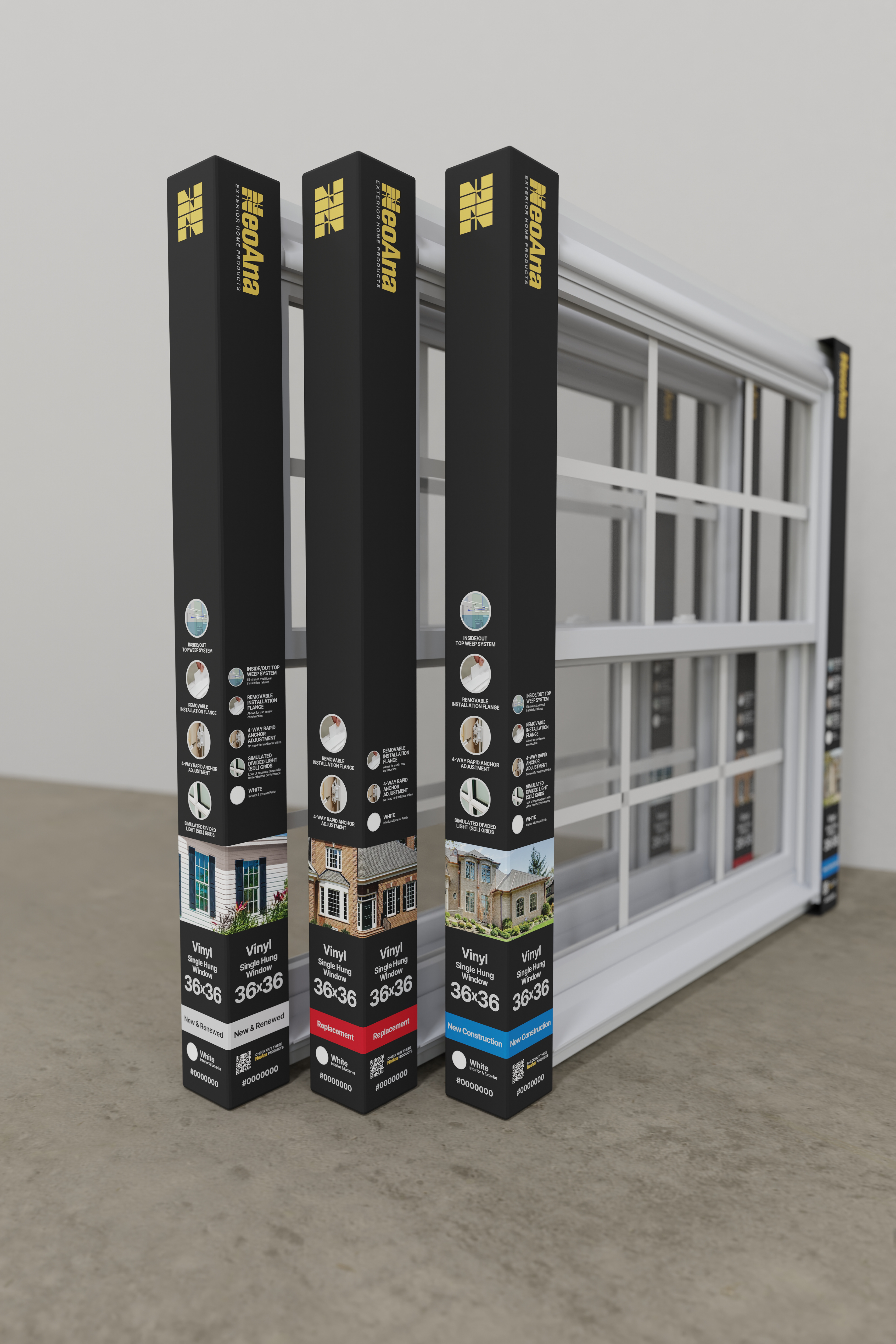
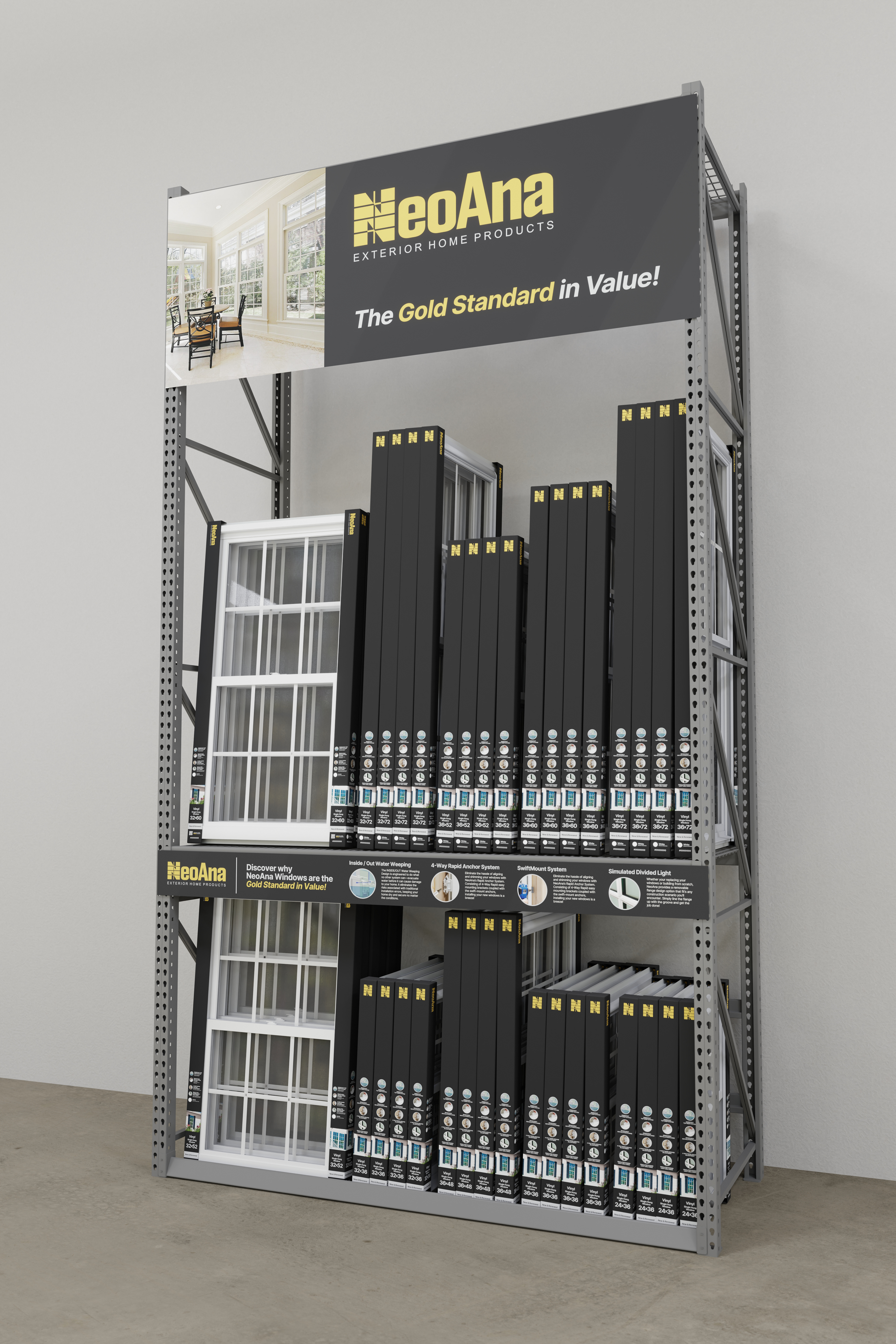
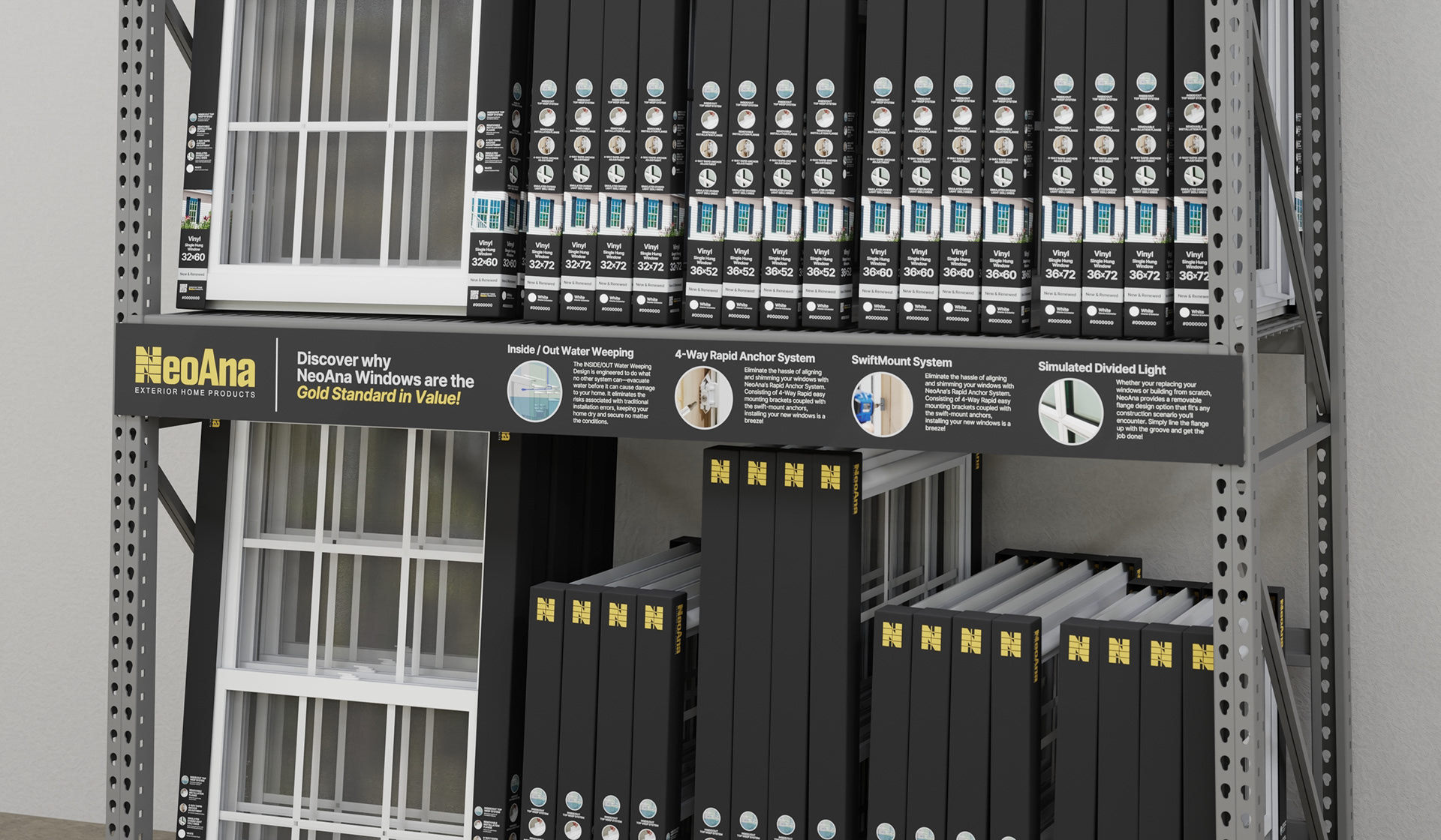
Black was selected as the primary packaging color to create immediate contrast to the competing brands.
Information hierarchy was carefully structured to improve legibility. In contrast to competitors that overload labels or misplace emphasis, the layout prioritizes key decision-driving details first. Typography scale, weight, and spacing support quick comprehension — whether a customer is walking past the shelf or actively comparing options.
A small color-coding system was introduced to differentiate product variants. These subtle signifiers allow customers to quickly distinguish use cases while maintaining the cohesive brand visuals.
* * *