Project Goals
Develop a branding system that is simple and intuitive to use, yet flexible enough to expand as the church grows. The identity needed to go beyond a single logo applied uniformly across materials, while also remaining streamlined enough for implementation by non-design staff.
The overall objective was to create a cohesive visual system that is clear, scalable, and easy to use.
Design Decisions
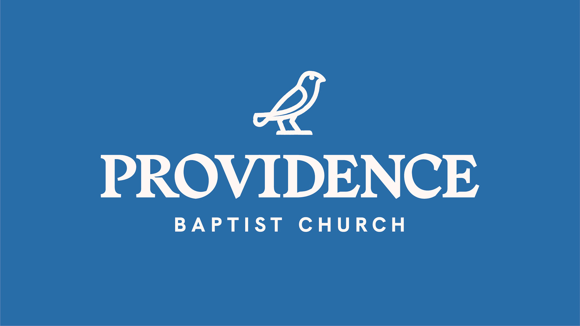
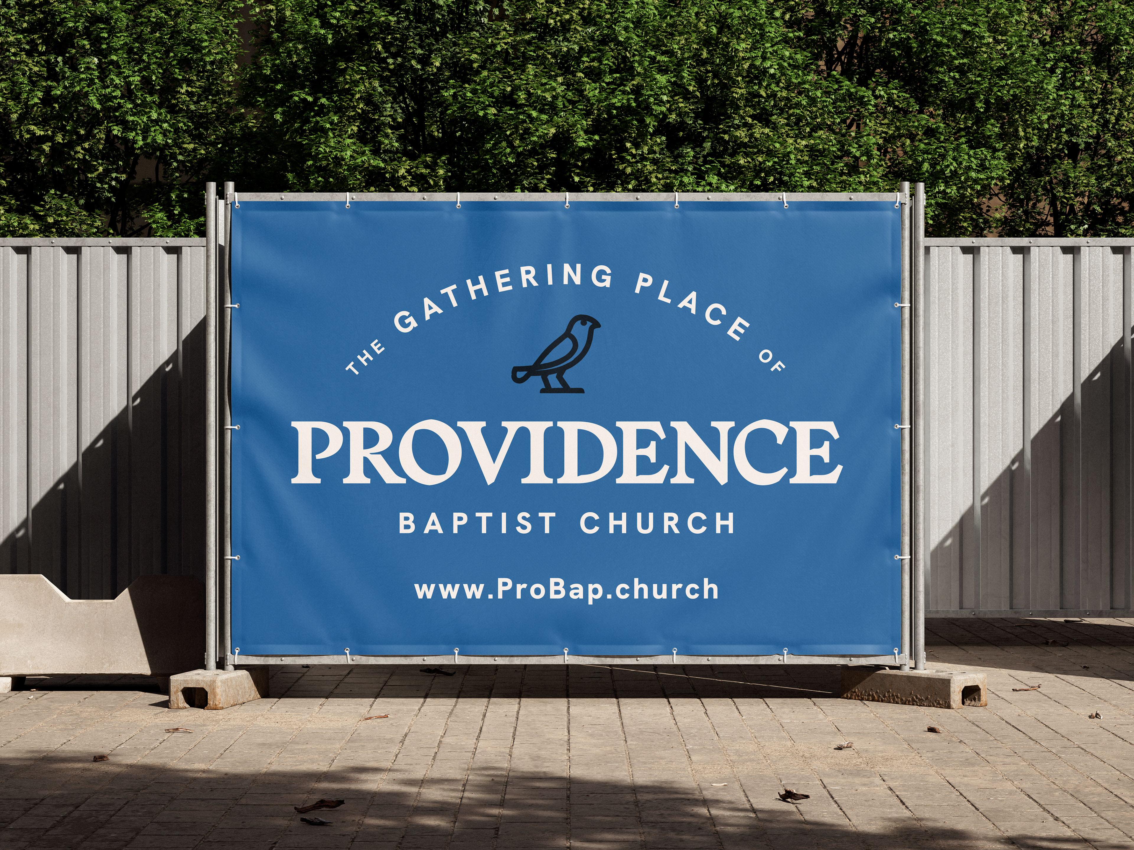
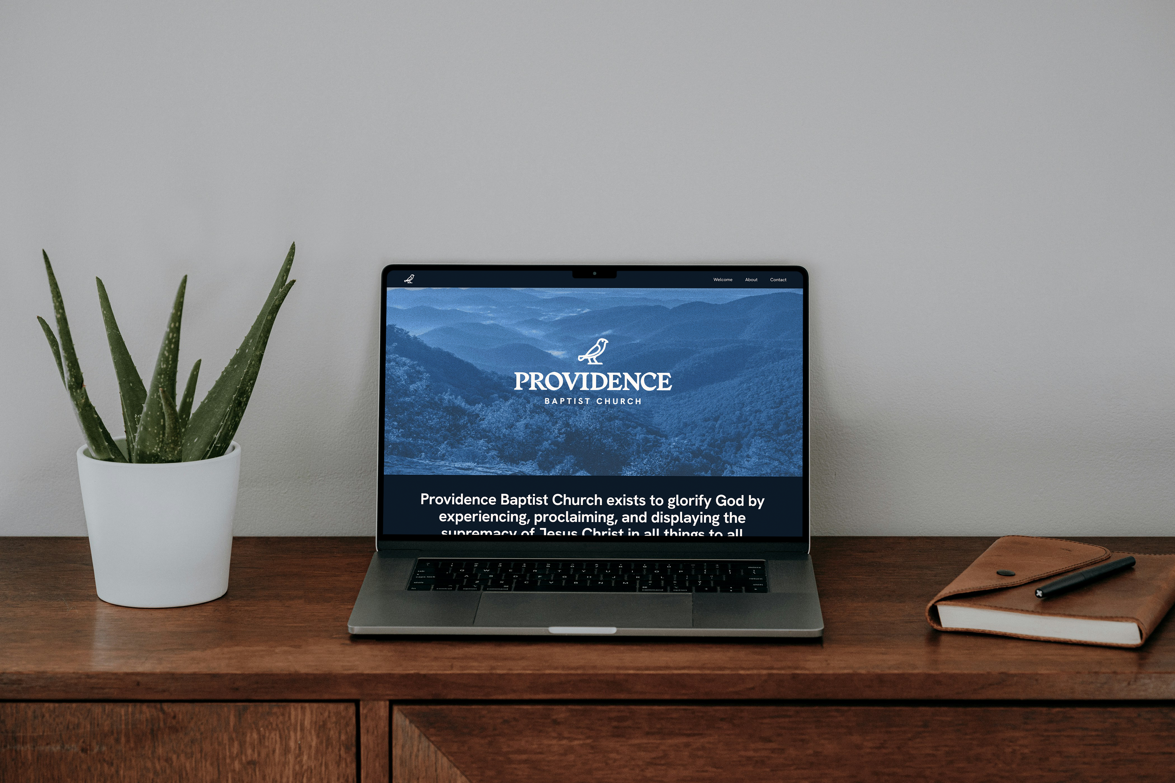
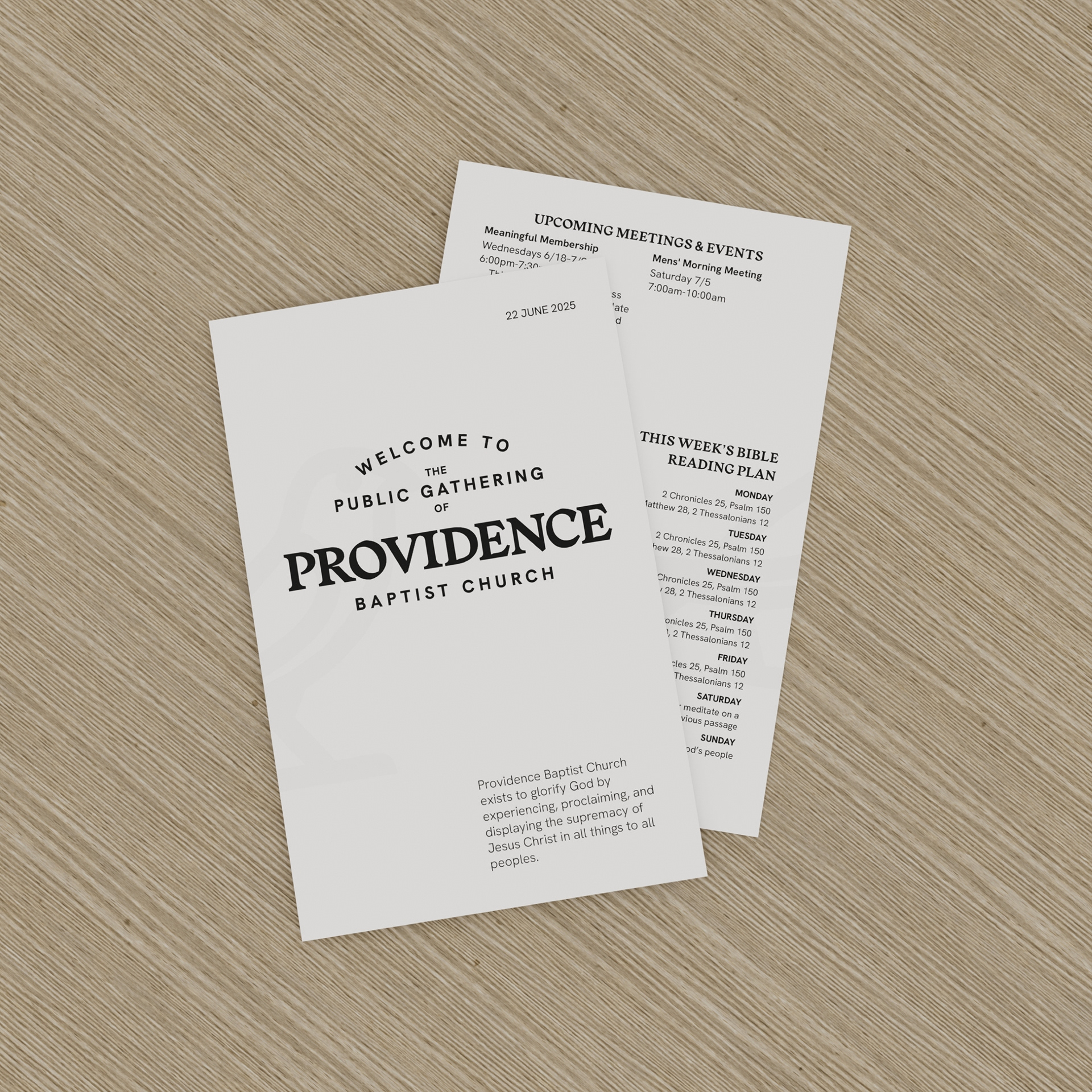
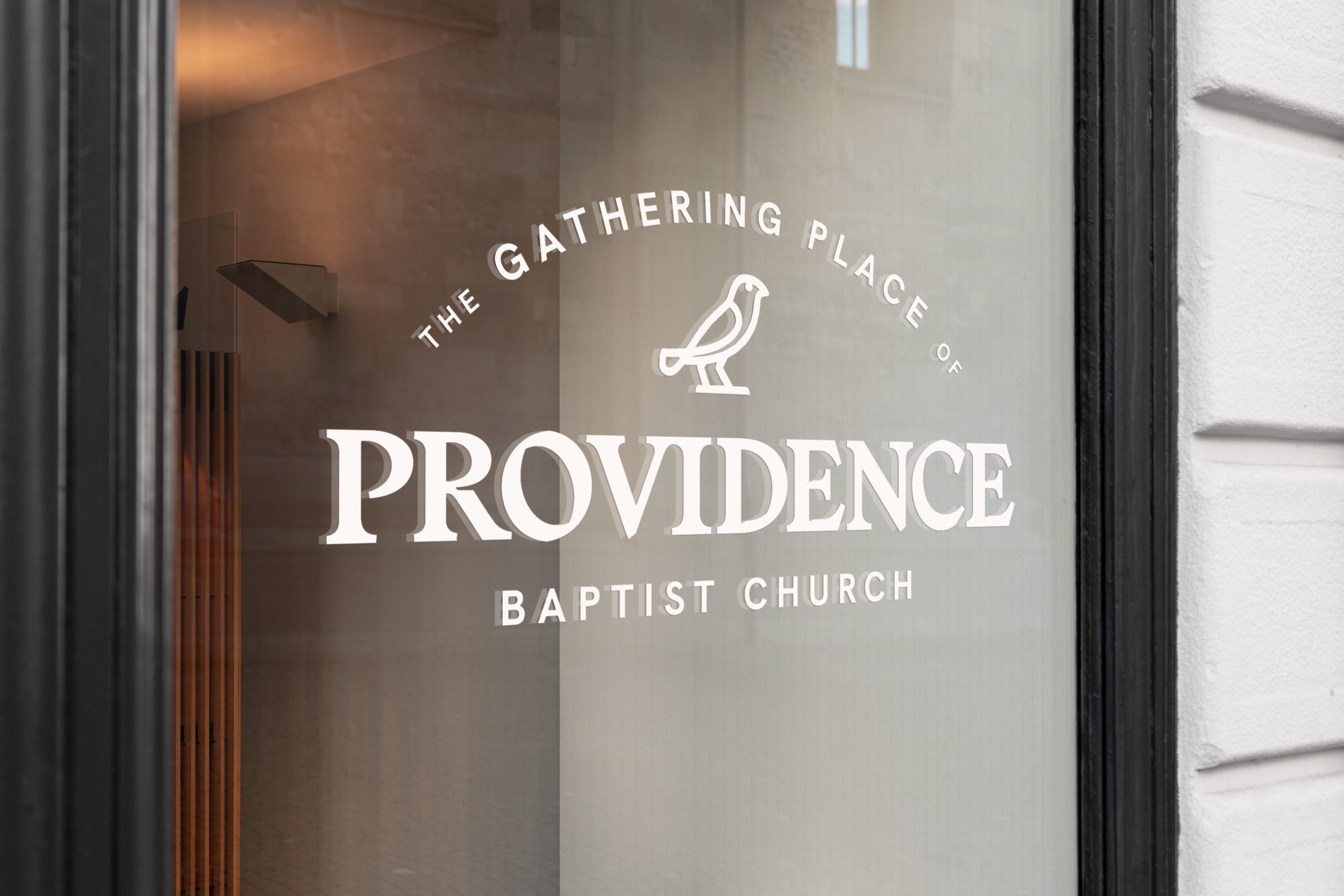
A core palette of off-white and muted black serve as a timeless, unified foundation across print and digital. A blue accent provides emphasis or calls to action, especially in signage and web applications.
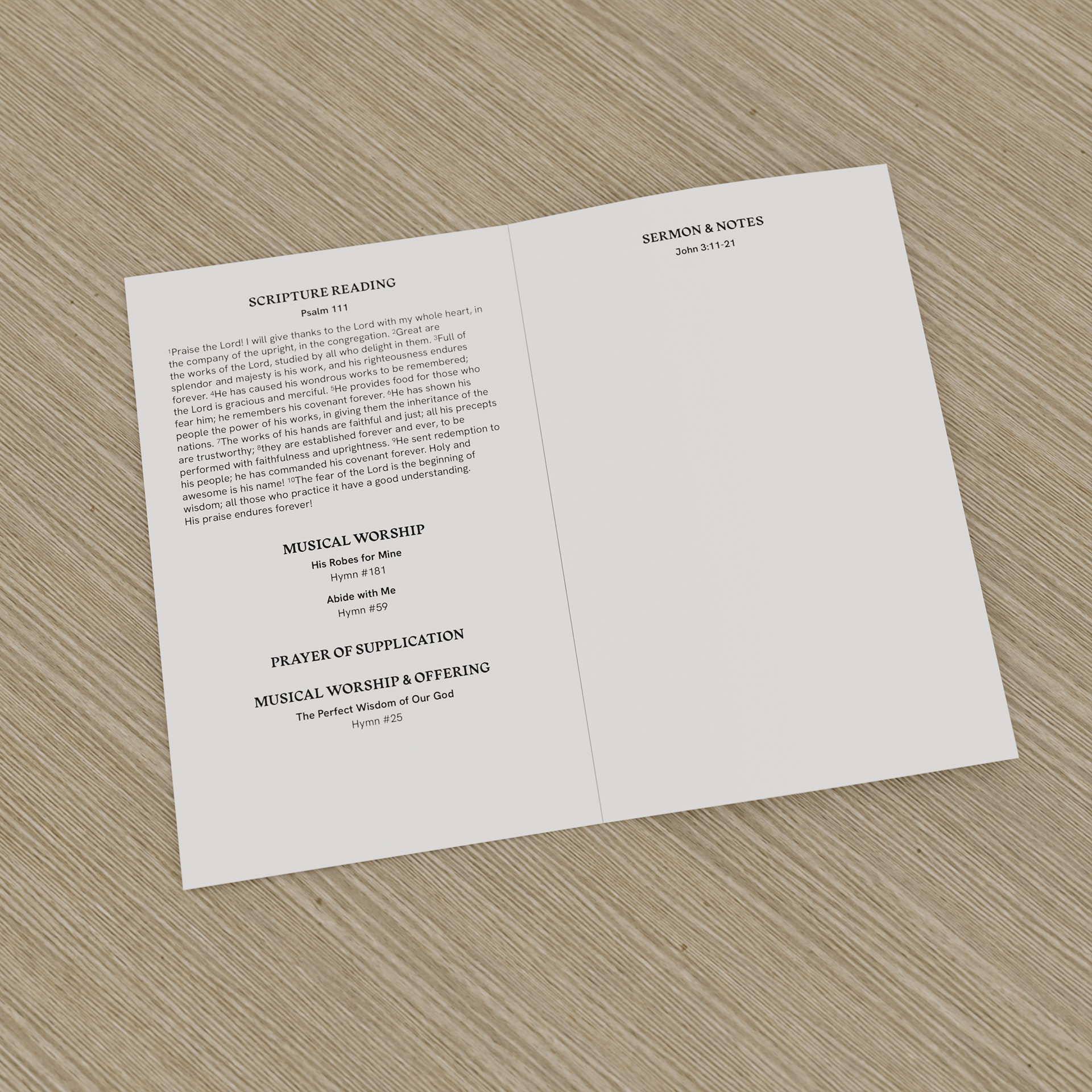
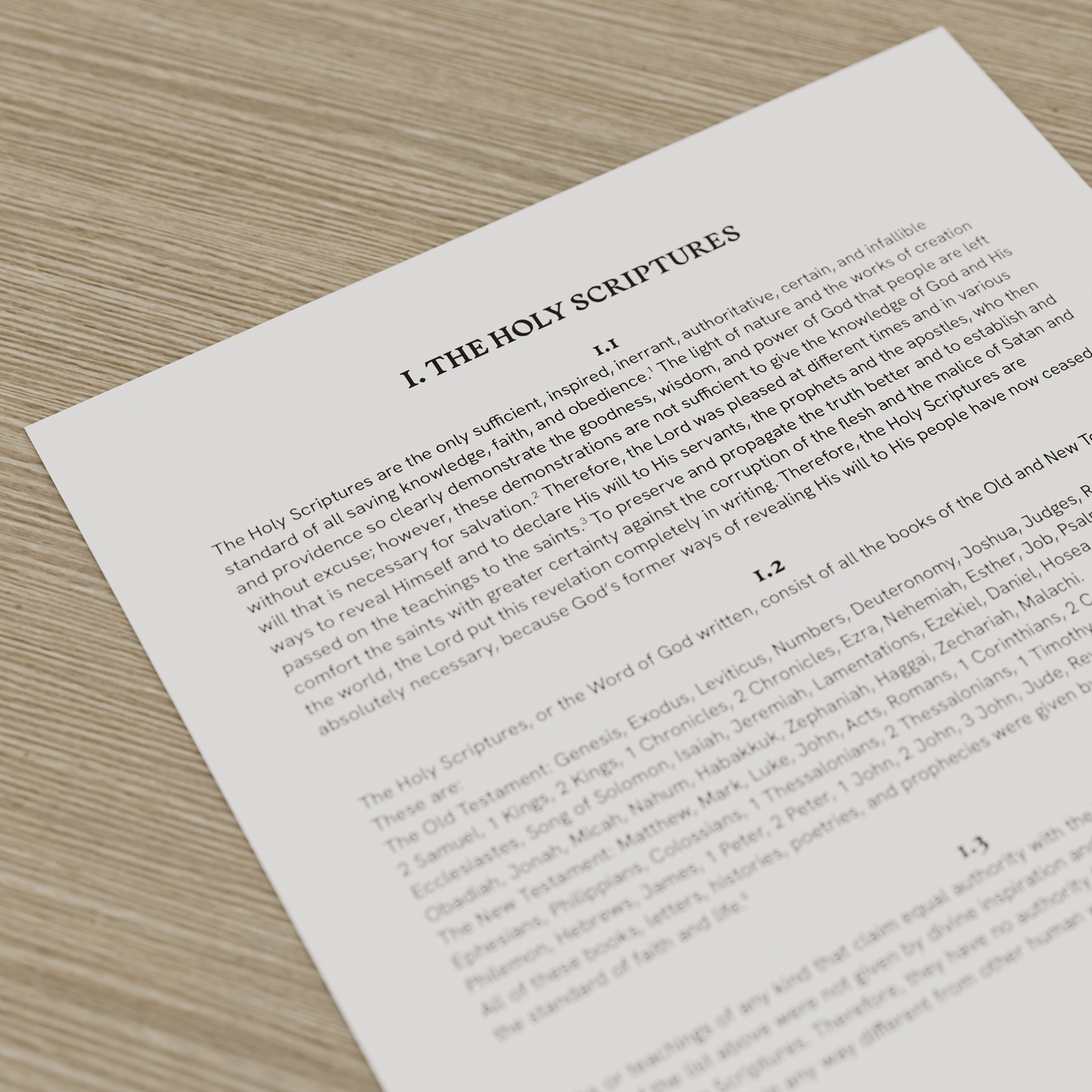
Typography was selected to create a unique tone as well as a professional hierarchy system. An old-style serif for headings conveys warmth and tradition, while a classic grotesque provides readability and a modern edge.
Design elements intentionally draw from historical references to align with the church’s focus on biblical and church history. The bird icon, inspired by hieroglyphs, uses a subtle hand-drawn quality. The Reformation-era serif and early grotesque sans-serif also introduce organic details. These characteristics combine to create a warm and inviting visual identity.
* * *